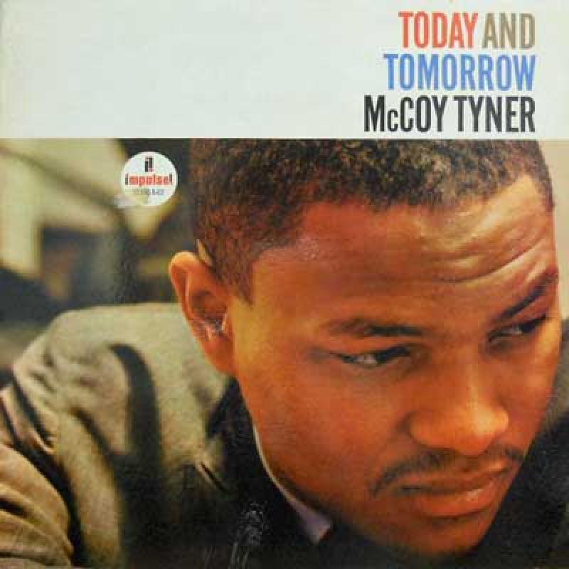
Reading up on jazz legend McCoy Tyner, I noticed that one biographer described him as a “maximalist.”
Until that point, I hadn’t even considered that maximalism might be a thing. In fact, as I type this, my computer has underlined that word in red, indicating that spellcheck doesn’t think maximalism is a thing either. It recognizes minimalism, but not its obvious opposite.
Minimalism gets more respect than maximalism across many disciplines: music, architecture, graphic design, typography, literature, vexillology…it seems like the vast majority of people believe that when it comes to the design of just about anything, less is more, and more is messy.
Minimalism is stylish, maximalism is gaudy.
Judging from the contents of this blog, I’m probably a minimalist too. I took a quick look through the archives and found that I’ve used the word “simple” over 50 times in describing why I find certain songs beautiful.
If I am a minimalist, I’m fine with that. But for the sake of variety, maybe it’s time for me to try a bit of maximalism. Maybe it’s time I appreciated the complex beauty of decorative Victorian architecture. Or the wordy prose of David Foster Wallace. Maybe there’s room in my life for a little more…more.
Let’s start with McCoy Tyner.
What makes this a beautiful song:
1. Tyner takes an old standard and makes the melody far more interesting with his Peterson-like decorations.
2. While Tyner’s right hand is off on its musical tangents, the drummer is brushing away quietly, like a calm parent watching their hyperactive child burn off steam at the playground.
3. At 4:26, he throws in a sudden diminished fifth (I think) that makes you feel like the song is fading away into the twilight zone.
Recommended listening activity:
Re-working your signature so that every letter in your name is legible.
